Quilt plots. Like heat maps, only…heat maps

Stephen tweets:

A "quilt plot"

A “quilt plot”


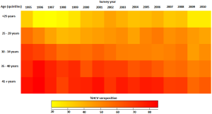
Quilt plots. Sounds interesting. The link points to a short article in PLoS ONE, containing a table and a figure. Here is Figure 1.

If you looked at that and thought “Hey, that’s a heat map!”, you are correct. That is a heat map. Let’s be quite clear about that. It’s a heat map.

So, how do the authors justify publishing a method for drawing heat maps and then calling them “quilt plots”?
Read the rest…
R has a JSON package

Named rjson, appropriately. It’s quite basic just now, but contains methods for interconversion between R objects and JSON. Something like this:

library(rjson)
data <- list(a=1,b=2,c=3)
json <- toJSON(data)
json
[1] "{\"a\":1,\"b\":2,\"c\":3}"
cat(json, file="data.json")

Use cases? I wonder if RApache could be used to build an API that serves R data in JSON format?