It’s been a while. I hope you are all well. Shall we make some charts?
ggplot2
Mapping the Vikings using R
The commute to my workplace is 90 minutes each way. Podcasts are my friend. I’m a long-time listener of In Our Time and enjoyed the recent episode about The Danelaw.
Melvyn and I hail from the same part of the world, and I learned as a child that many of the local place names there were derived from Old Norse or Danish. Notably: places ending in -by denote a farmstead, settlement or village; those ending in -thwaite mean a clearing or meadow.
So how local are those names? Time for some quick and dirty maps using R.
Continue reading
Feels like a dry winter – but what does the data say?
Update Feb 9 2020: Weather Underground retired their free API in 2018 so the code in this post no longer works
 A reminder that when idle queries pop into your head, the answer can often be found using R + online data. And a brief excursion into accessing the Weather Underground.
One interesting aspect of Australian life, even in coastal urban areas like Sydney, is that sometimes it just stops raining. For weeks or months at a time. The realisation hits slowly: at some point you look around at the yellow-brown lawns, ovals and “nature strips” and say “gee, I don’t remember the last time it rained.”
Thankfully in our data-rich world, it’s relatively easy to find out whether the dry spell is really as long as it feels. In Australia, meteorological data is readily available via the Bureau of Meteorology (known as BoM). Another source is the Weather Underground (WU), which has the benefit that there may be data from a personal weather station much closer to you than the BoM stations.
Here’s how you can access WU data using R and see whether your fuzzy recollection is matched by reality.
Continue reading
Years as coloured bars
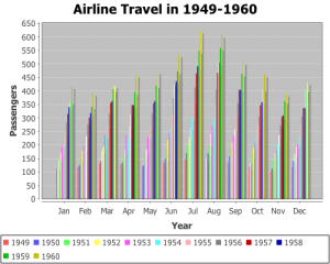 I keep seeing years represented by coloured bars. First it was that demographic tsunami chart. Then there are examples like the one on the right, which came up in a web search today. I even saw one (whispers) at work today.
I get what they are trying to do – illustrate trends within categories over time – but I don’t think years as coloured bars is the way to go. To me, progression over time suggests that time should be an axis, so as the eye moves along the data from one end to the other, without interruption. What I want to see is categories over time, not time within categories.
So what is the way to go? Let’s ask “what would ggplot2 do?”
Continue reading
Hyetographs, hydrographs and highcharter
Dual y-axes: yes or no? What about if one of them is also reversed, i.e. values increase from the top of the chart to the bottom?
Judging by this StackOverflow question, hydrologists are fond of both of these things. It asks whether ggplot2 can be used to generate a “rainfall hyetograph and streamflow hydrograph”, which looks like this:
Putting data on maps using R: easier than ever
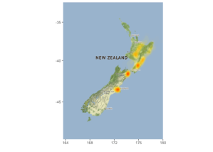
New Zealand earthquake density 2010 – November 2016
A couple of key R packages in this space: ggmap and gganimate. To illustrate, I’ve used data from the recent New Zealand earthquake to generate some static maps and an animation. Here’s the Github repository and a report. Thanks to Florian Teschner for a great ggmap tutorial which got me started.
My own work in bioinformatics to date has not (sadly!) required much analysis of geospatial data but I can see use cases in many areas – environmental microbiology, for example.
R and the Nobel Prize API
The Nobel Prizes. Love them? Hate them? Are they still relevant, meaningful? Go on admit it, you always imagined you would win one day.
Whatever you think of them, the 2015 results are in. What’s more, the good people of the Nobel Foundation offer us free access to data via an API. I’ve published a document showing some of the ways to access and analyse their data using R. Just to get you started:
library(jsonlite)
u     <- "http://api.nobelprize.org/v1/laureate.json"
nobel <- fromJSON(u)
In this post, just the highlights. Click the images for larger versions.
Continue reading
Project Tycho, ggplot2 and the shameless stealing of blog ideas
Last week, Mick Watson posted a terrific article on using R to recreate the visualizations in this WSJ article on the impact of vaccination. Someone beat me to the obvious joke.
Someone also beat me to the standard response whenever base R graphics are used.
And despite devoting much of a morning to it, I was beaten to publication of a version using ggplot2.
Why then would I even bother to write this post. Well, because I did things a little differently; diversity of opinion and illustration of alternative approaches are good. And because on the internet, it’s quite acceptable to appropriate great ideas from other people when you lack any inspiration yourself. And because I devoted much of Friday morning to it.
Here then is my “exploration of what Mick did already, only using ggplot2 like Ben did already.”
Continue reading
R/ggplot2 tip: aes_string
I’m a big fan of ggplot2. Recently, I ran into a situation which called for a useful feature that I had not used previously: aes_string.
Read the rest…
Analysis of retractions in PubMed
As so often happens these days, a brief post at FriendFeed got me thinking about data analysis. Entitled “So how many retractions are there every year, anyway?”, the post links to this article at Retraction Watch. It discusses ways to estimate the number of retractions and in particular, a recent article in the Journal of Medical Ethics (subscription only, sorry) which addresses the issue.
As Christina pointed out in a comment at Retraction Watch, there are thousands of scientific journals of which PubMed indexes only a fraction. However, PubMed is relatively easy to analyse using a little Ruby and R. So, here we go…
Read the rest…
